Putting something on the walls is not just a decoration; it is also like enhancing the soul of your house. Many times we keep thinking – what to put, where to put, how big it should be, and which color will go well? When the walls of your new house were empty, every time you looked at them, it felt as if something was left incomplete. But as you understood the style of your place, choosing art became easier. Every room has a mood, and if it is captured, the walls start speaking for themselves.
Identify Your Home Style First
It is important first to identify the style of your home. Is your home modern, traditional, boho, or a bit of a mix-up? Your living room has minimal furniture and very limited colors, and the space is uncluttered—that is, clean. In such a situation, You chose black-and-white photography that fit perfectly on the wall in a big frame. On the other hand, a friend’s boho-style home has a gallery wall of colorful prints of different sizes and mixed frames, which brings the place alive.
How Color Palettes Influence Art Choices
Color is the thread that ties every room together. If your room has neutral shades, a bold art piece can break up the simplicity and create a focal point. You have a deep blue and bronze-toned canvas on your bedroom wall, which gives the room a certain temperature and depth. On the other hand, if the environment is already very colorful, the artwork should be a little calmer and match to maintain visual balance.
Understanding Your Furniture and Layout
The furniture and layout of the room also influence art selection. For example, if you have mid-century modern furniture, wooden tables, and chairs with clean lines. An abstract or geometric design painting on the wall can create a nice harmony. In your dining space, you have light wood furniture, so you placed a soft watercolor artwork there that balances the tones.
Wall Art Types That Match Different Styles
Minimalist Spaces
Minimalism is all about saying more with less. Line art or monochrome prints are the best fit for such spaces. You once put up a frame of a face made of just a single line, and people kept asking me how it looked so simple yet so impressive. The white background and black strokes of this art make the room feel clean, calm, and thoughtful.
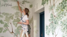
Boho Homes
In a boho space, the variety and combination of colors make every wall a canvas. You saw handmade macrame wall hangings in a friend’s home, with intricate knots of cotton thread, like shadows from an old story. Tapestries, vibrant prints, and wall hangings with floral designs capture the boho energy that keeps the space alive.
Industrial Style
Industrial design is a balance of rawness and strength. When you saw abstract wall art in raw metal in a friend’s studio, it drew attention straight away. Steel sculptures on exposed brick walls seem to speak to the soul of a factory. This style is for those who see the power of manufacturing in artistry.
Scandinavian
Scandinavian design emphasizes a connection to nature and a preference for soft colors. Framed forest photos or wintery landscapes on white and gray walls complement this style beautifully. One of your Scandinavian-themed guest rooms has a black and white photo of snow-capped pine trees on the wall. Everyone who walks in stops and looks at it.
Classic Interiors
Classic canvas paintings have always had a place in traditional decor. For example, a large framed oil painting on canvas of trees, rivers, or a portrait of a woman, decorated and framed, creates a sense of comfort and elegance. Such artworks do not look dated even with time. An old still life painting of your grandfather still adorns our home.
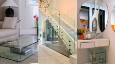
How to Choose the Right Size and Placement
Choosing the size and placement of art on the wall is just as important as the art itself. Artwork above the sofa should be about 2/3 of its width. You placed about 50 inches of art above the 7-foot-wide sofa in your hall, and the balance was perfect. The height should also be at eye level – about 57–60 inches from the floor.
Centering vs. Asymmetrical Layouts
Art doesn’t have to be centered everywhere. Sometimes, focusing on one side of a wall can create a completely different effect. In your study, you placed a sketch slightly off-center on the right side, which increases the perception of height in the room.
Using Large-Scale Art as a Focal Point
A large-scale piece of art can be a statement piece in any room. The first thing you see in your living room is a 5×4-foot canvas that becomes the center of a whole conversation.
Gallery Walls: When and How to Build One
If you have several smaller pieces, creating a gallery wall is a great way to go. But it has to have cohesion – either in color or in frame style. You put three paintings on one wall in your bedroom. All with a touch of blue, which gives an organized and calming feel.
Tips to Make Your Wall Art Feel Cohesive
The magic of coordinating art is amazing. The color scheme, the variety of frames, and the contrast between the art pieces all combine to create a story. You paired a mixed media piece with two smaller handmade pieces and placed an antique mirror in the middle – the result? The wall itself became an experience.
Stick to a color scheme
A unified color palette makes all the difference. Your wall art looks best when pieces share similar tones and intensity. Large collections should match your room’s existing colors to improve the overall look. Even mixed-style galleries can work well together. Just pick one or two colors that appear throughout different pieces to create a visual connection.
Mixing frames and materials wisely
Your choice of frames is a vital part of the overall look. Small spaces work best with just three frame styles at first – maybe white, black, and wood options. You can add more variety as your collection grows. Traditional frames aren’t your only choice. Mix in some textiles, ceramic pieces, or embroidery hoops to add dimension and break up any rigid patterns.
Layering art with shelves or mirrors
Add depth by placing art pieces on console tables, nightstands, or shelves. This creates visual interest without making extra holes in your walls. Mirrors placed between artwork reflect light around the room and add a nice contrast to flat pieces.
Using lighting to highlight pieces
The right lighting can turn a good display into something amazing. Place lights at a 30-degree angle to cut down glare and show off textures better. Picture lights should cover 65-75% of the frame width. Track lighting gives you more flexibility with modern installations.
Conclusion
Wall decor is not just about looking pretty; it is about making a house “home.” When art matches your style, colors, and furniture, it’s not just an object – It is a part of it. With careful thought and a little heart, every wall can tell a story that’s yours.